The Problem
While working at Hautelook / Nordstrom Rack (both owned by Nordstrom, Inc.), I was in charge of the transition from a desktop experience on mobile web browsers to an actual mobile web optimized experience. While reviewing the usage date, I discovered that users selected the size filter most of the time. What I didn't know was why and under what circumstances would users select the size filter. So I convinced key stakeholders to let me conduct observational user interviews, and the results of the interview process were quite impressive.
Users would see pictures on the catalog page and immediately begin scrolling, which of course would mean that they would miss the "filter button." Additionally, many users were shopping for other family members and would often need only to see items in a specific size. It became clear that eliminating this source of friction would help increase conversions.
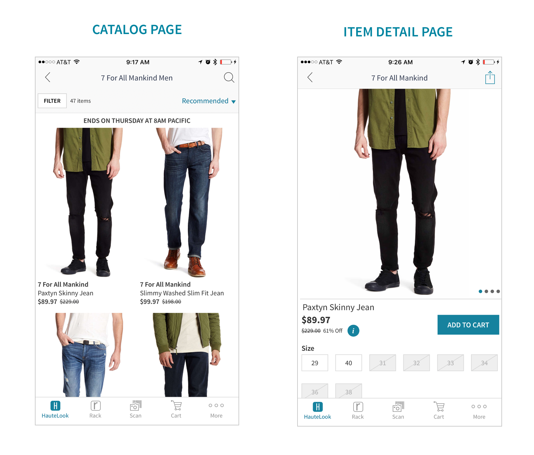
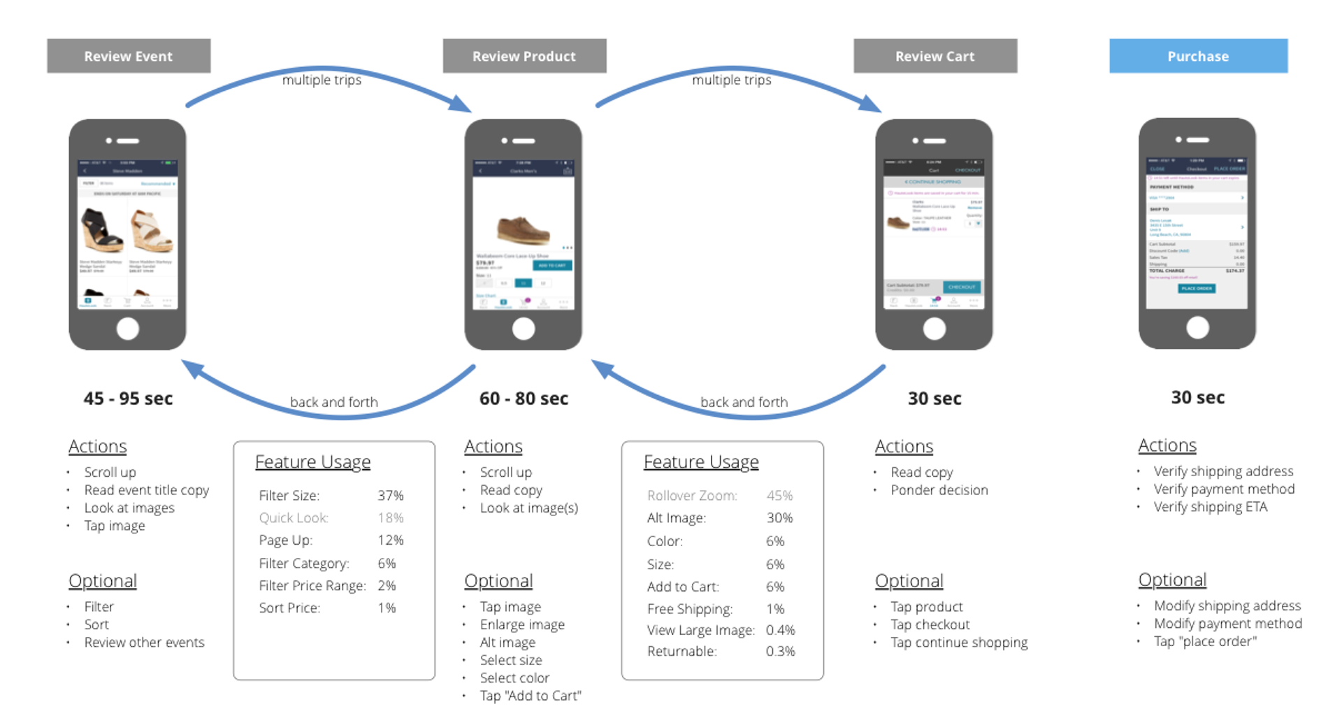
Invariably, the user would land on the item detail page and find that the item was not available in their size and then return to another catalog page and then repeat this cycle over and over again. I synthesized both qualitative and quantitative data to help the team better understand how users were interacting with the size filter.
The Solution
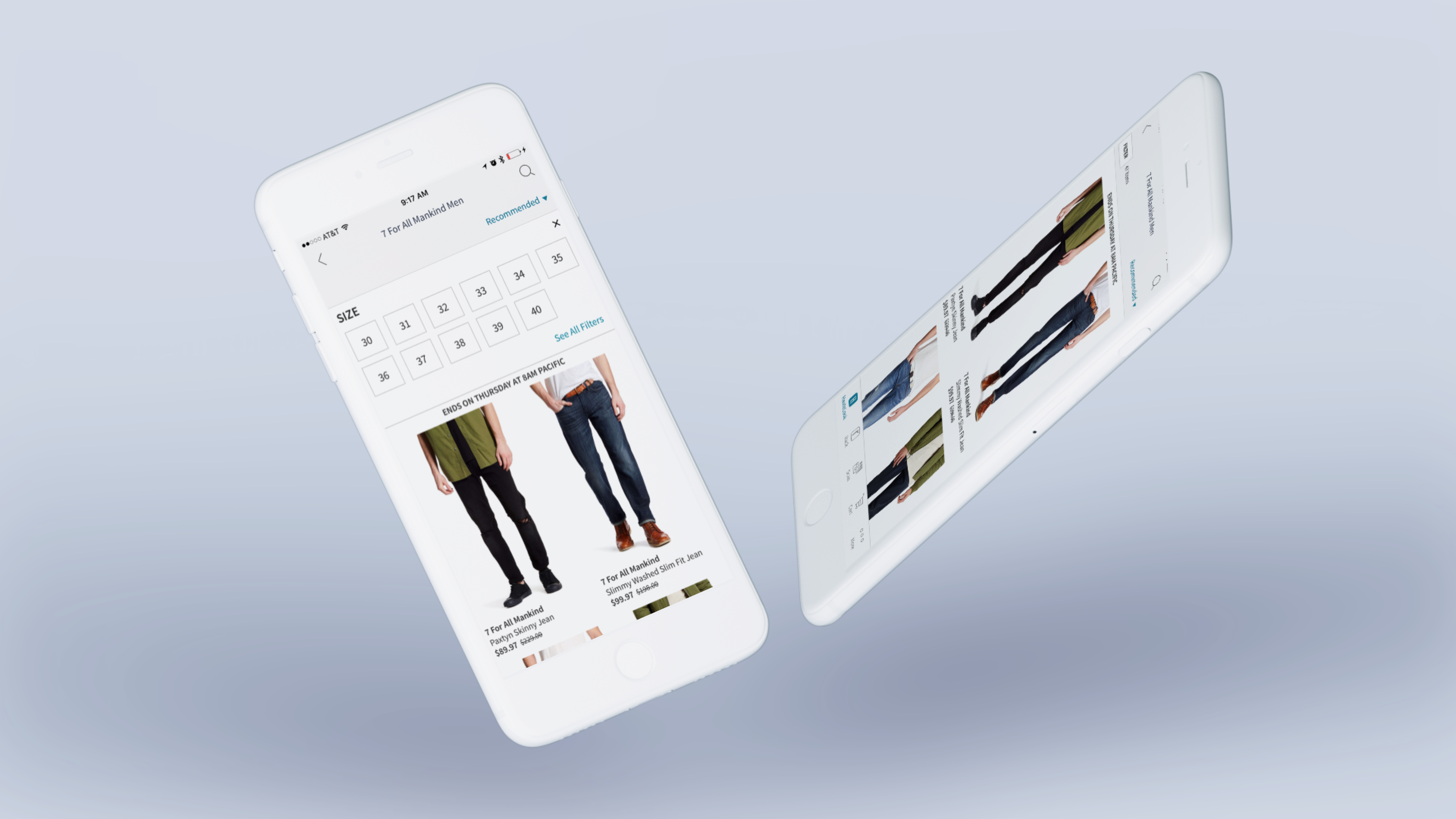
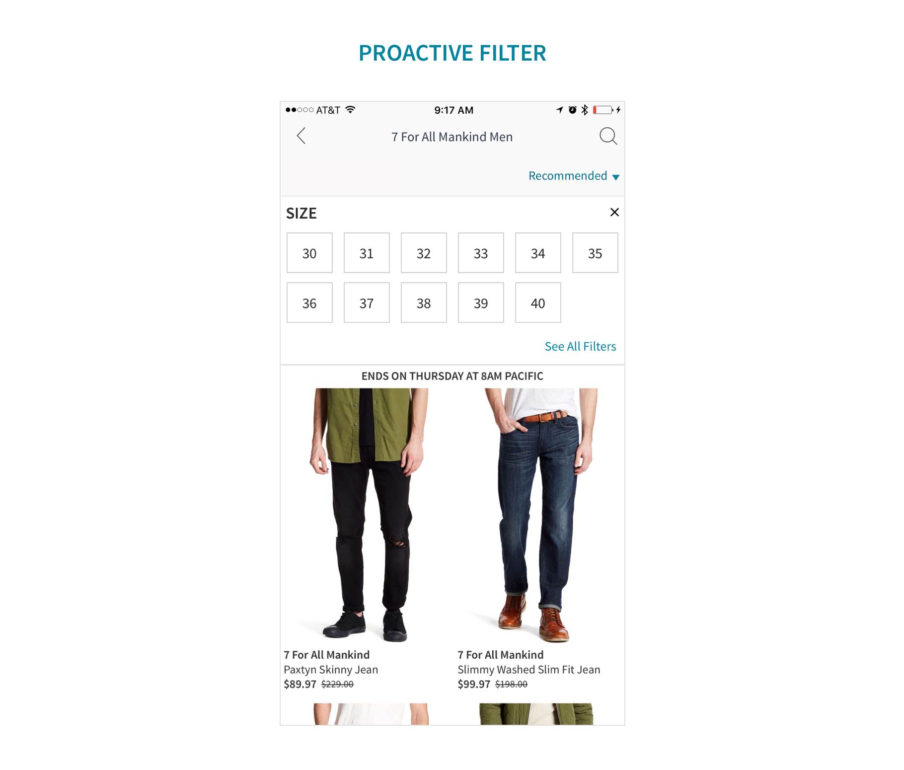
After thinking it through, I came up with an idea to unfurl a truncated filter drawer. Please see below.
THE RESULT
After its release, we saw a 15% increase in the use of the size filter and increased conversion by 0.15%.