The Problem
Service Titan http://www.servicetitan.com is a B2B SaaS company who makes end-to-end software for the plumbing, electrician, and heating and air conditioning services industry. There were two main components to the software suite - Desktop 1.0 and Mobile 1.0.
Desktop handled more complex tasks such as advanced scheduling, invoicing, detailed reporting, and user management. Mobile handled less complex tasks such as inspection survey collection, photo and note gathering, quote creation and presentation, payment collection, and emailing of receipts to end customers.
I was the first design resource hired by the company shortly after the Head of Product. I was able to convince the company to conduct a redesign of the Mobile product as a strategic initiative for the back half of 2015 with a target release for late Jan 2016. The team consisted of Dir, Product Management, UI Designer, Product Manager, and the Chief Product Officer (Co-Founder). At a high level, we followed a UX to UI transition model where I would work closely with UI and Product for all UX efforts while also working with UI to help shape our design pattern library.
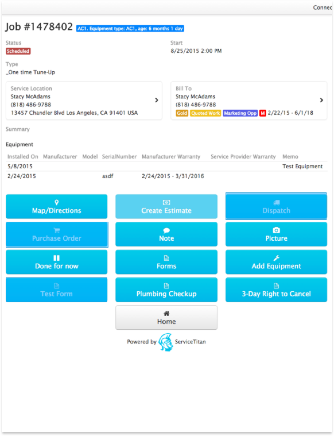
Previous Design
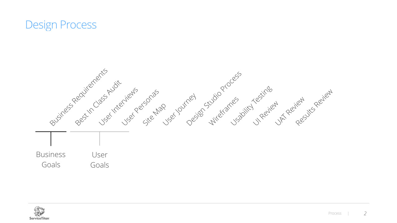
Design Process
I have used this design process in the past for several projects and thought it would be a great fit here as well. Generally speaking, this process is not quite as linear as denoted here, and that was certainly the case during this project. Although we did not complete all of the steps or complete the steps in this exact order, we were able to use this process to inform our design decisions.
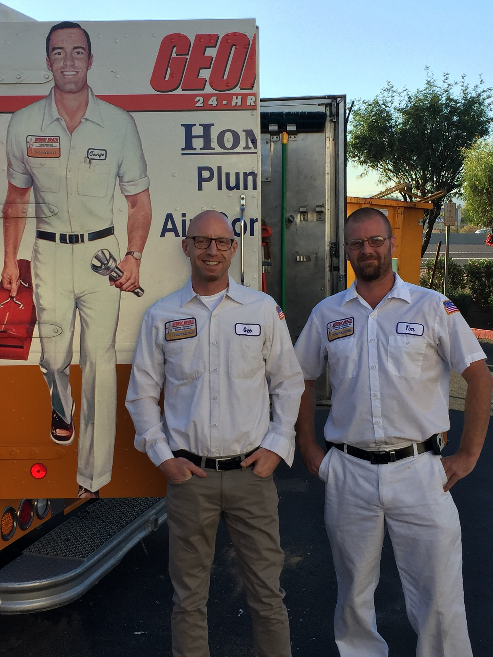
User Ride Alongs
I conducted ride alongs for two days with plumbers and electricians to better understand their day-to-day work challenges. My primary focus was to observe technicians using the 1.0 version of the tablet software while in the throughs of designing the 2.0 release. This experience also helped further define user personas. Also, in case you are wondering, yes, that's me on the left, and no, I didn't have to put my hands in a toilet.
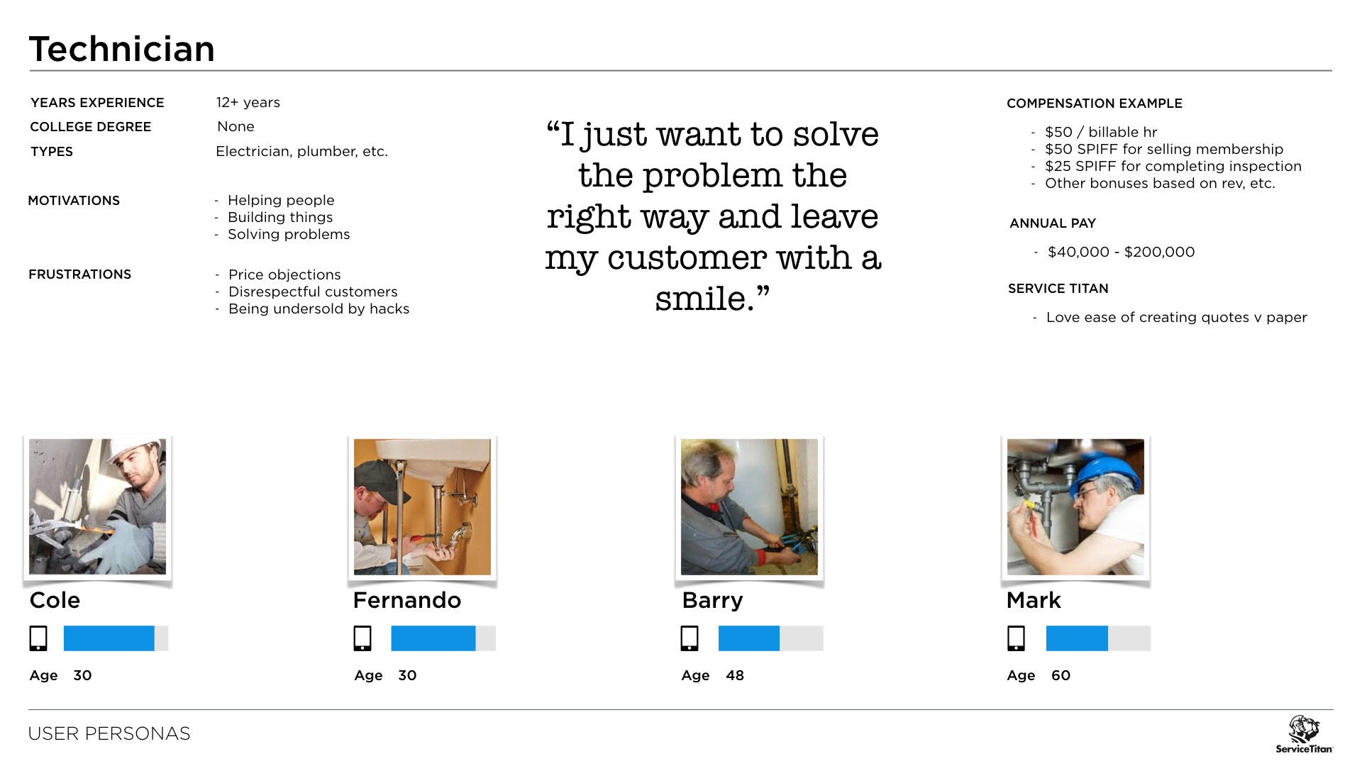
User Personas
I used a combination of internal stakeholder, industry consultant, phone and in-field customer interviews to inform the user personas I created.
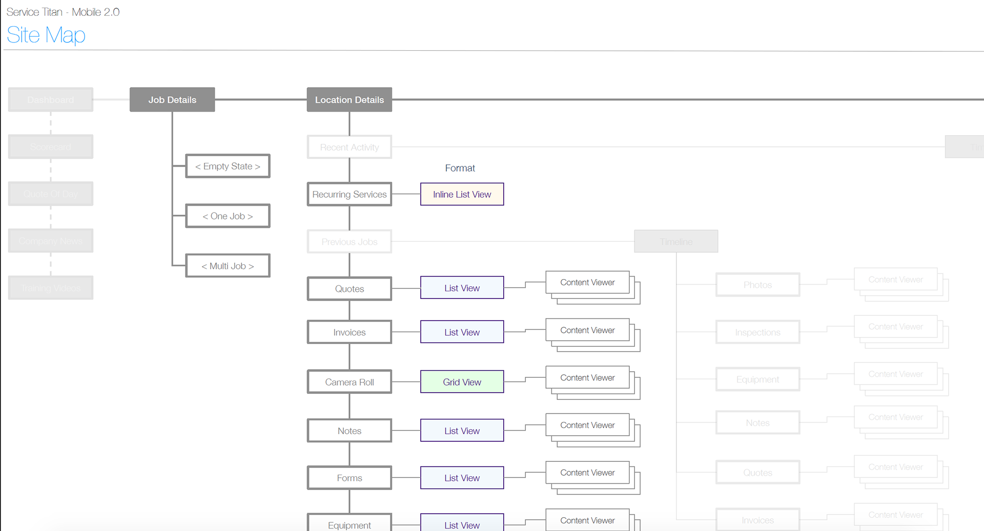
Site Map
Here are a couple of examples of the site map. We were able to use the site map to discuss the overall structure of the application and review areas for clarification with the Product Manager.
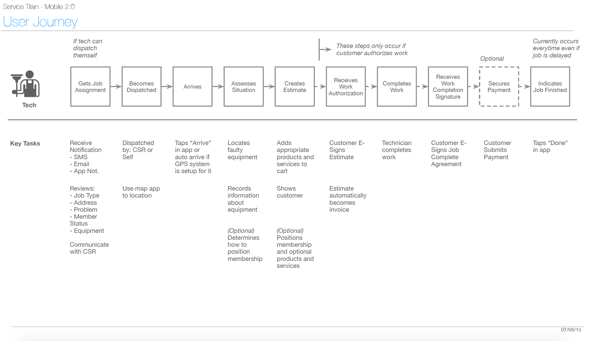
User Journey
Probably my favorite part of the process is the user journey. If you don't get this right, it is almost impossible to think in terms of the significant tasks your user is trying to accomplish. I was able to validate this flow of the technician across over 20 employees who deal directly with customers as well as countless customer and industry consultants. The user journey turned out to be the critical tool used to shape the initial structure of the application.
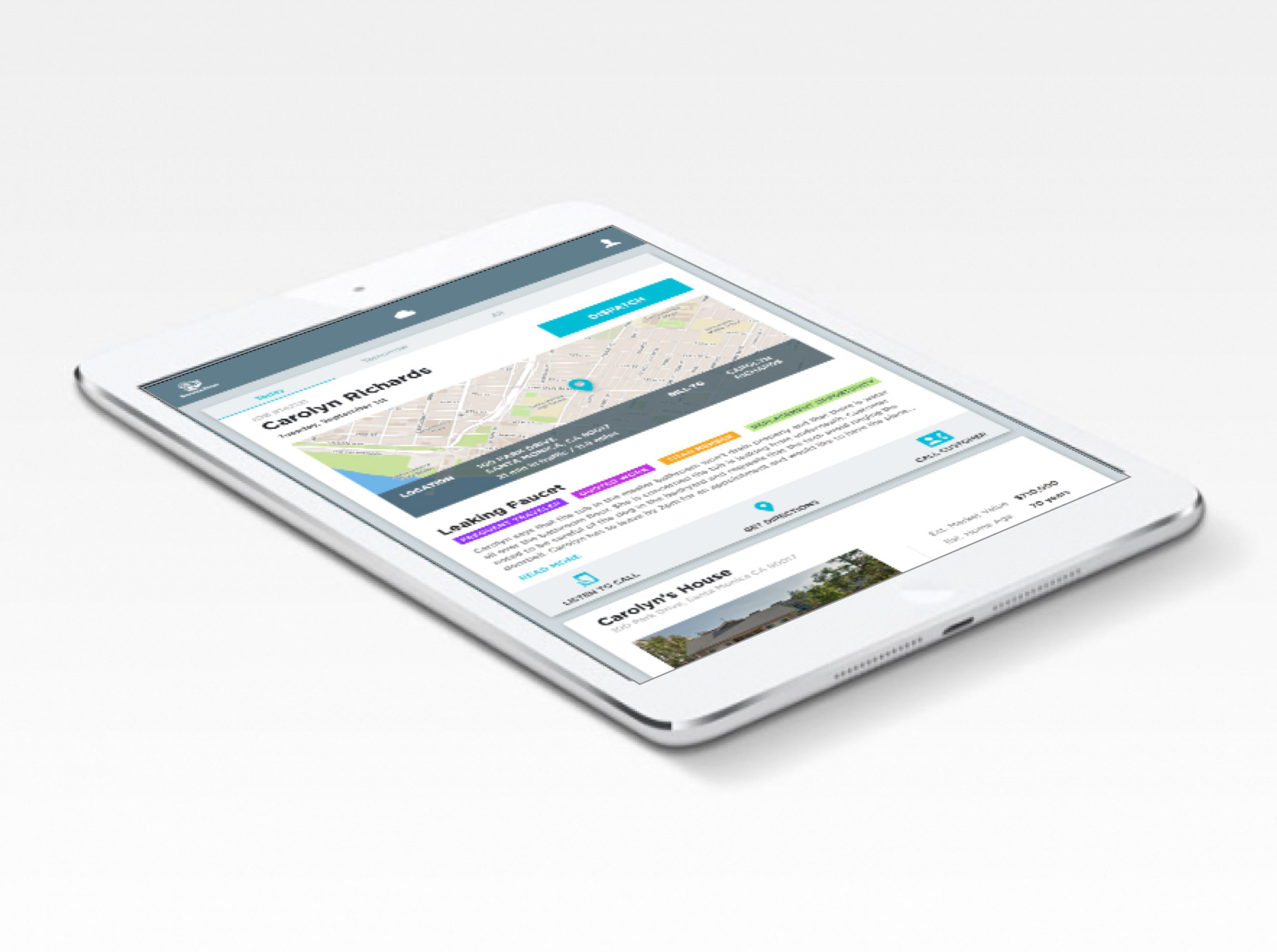
UI Evolution
Here are a couple of early UI iterations.
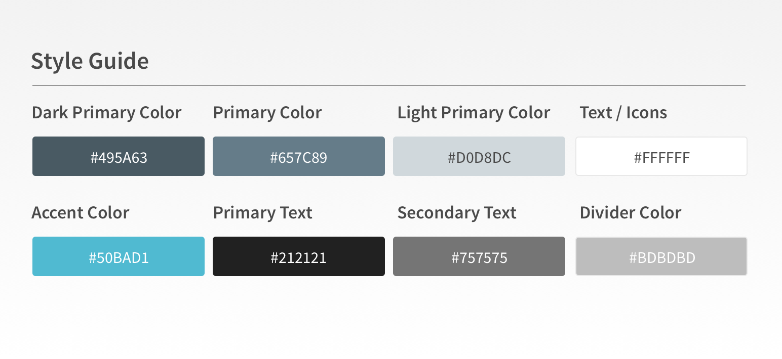
Base Color Palette
Here is the base color palette.
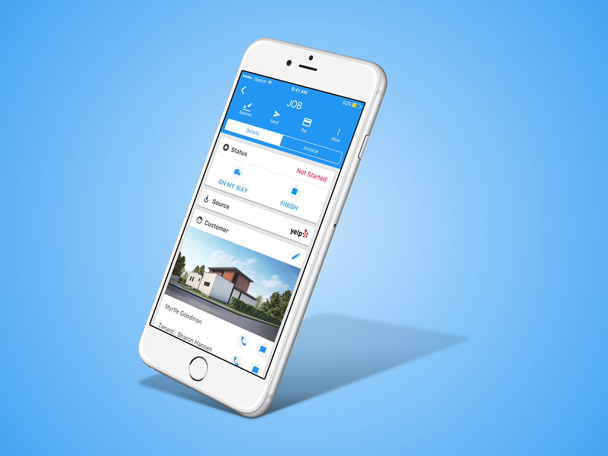
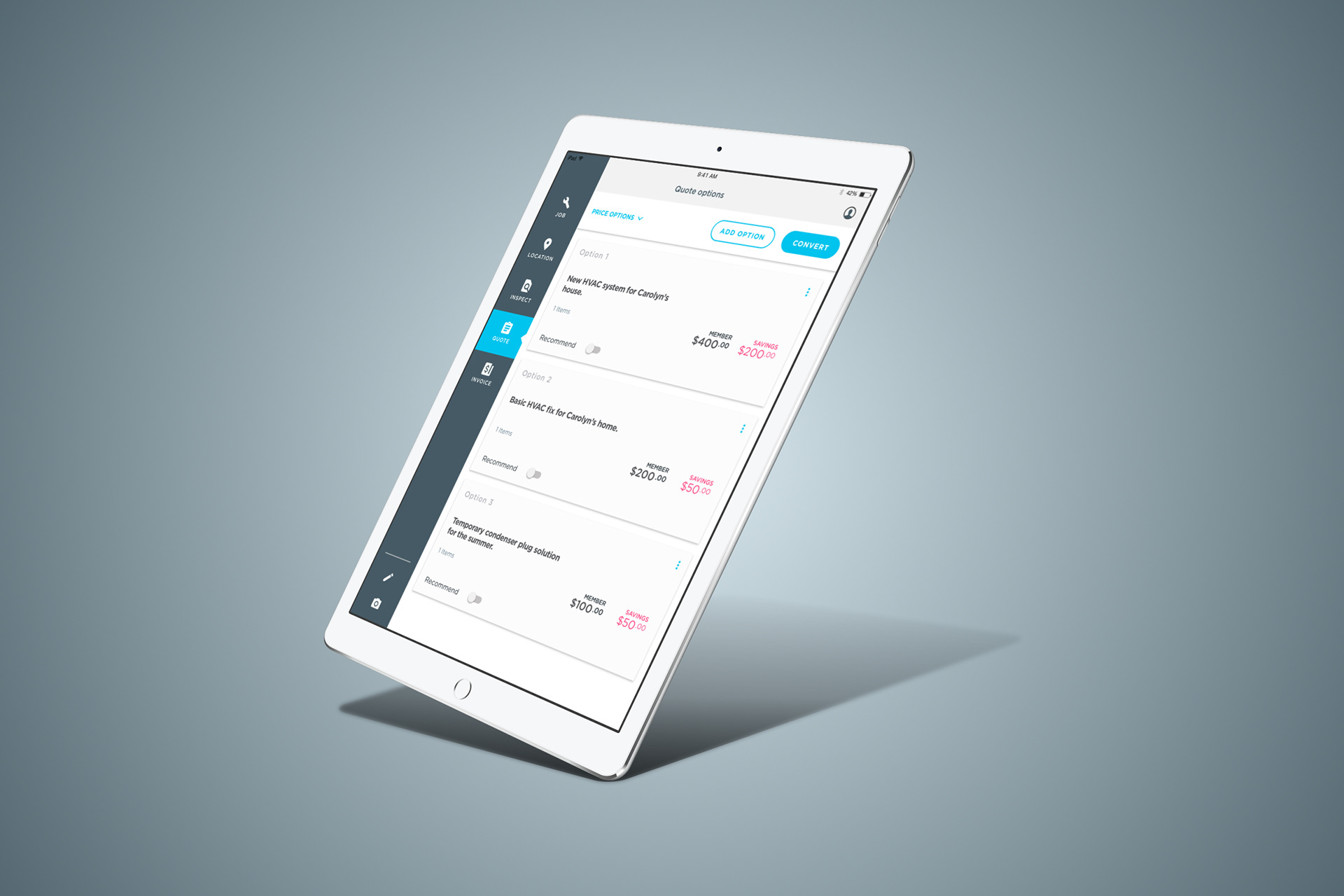
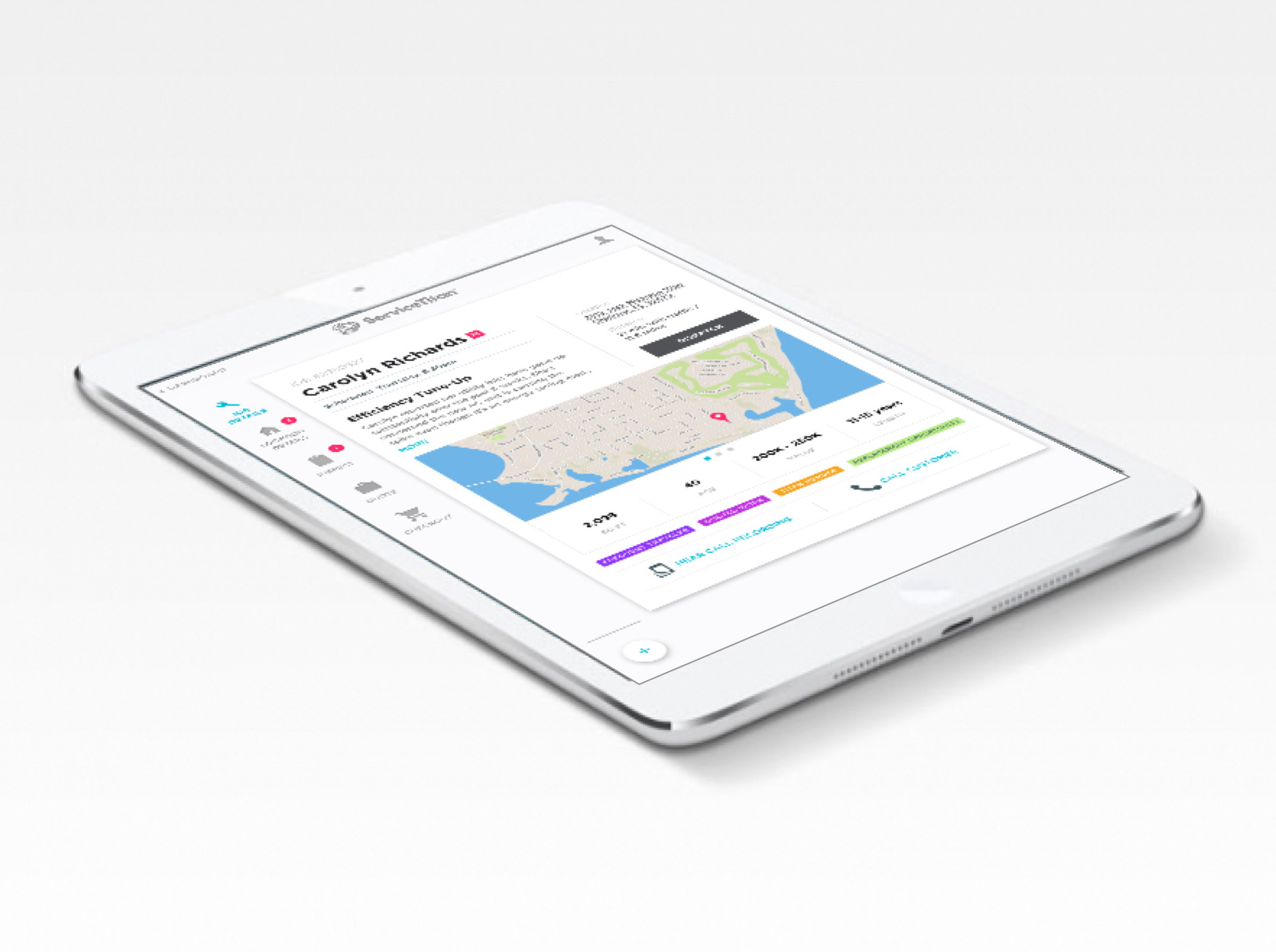
Final UI
Here is the final UI.

The Results
The time needed to train new technicians was reduced by over 34% which is a key metric for the high turnover home services industry.